 The sketch or idea
I passed by this house often as I rode the bike path along the shores of Rivière des Prairies (The Back River). This white clapboard corniced house sits at the foot of Berri Street. One day in 1999 I sketched it.
A few years later I used this drawing as a motif for a watercolor demonstration at Ogilvy, Montreal. I felt this sketch was a proper choice for a vignette because it satisfied to a certain extent Edgar Whitney’s “rules” for a good vignette.

Rules for painting a vignette according to Edgar Whitney
1. The white space has to be designed with equal care as the painted area.
2. The touched (painted) area should constitute 60 to 70 percent of the white paper.
3. Out of the 360 degrees of the outer edge of the painting, 60 degrees should consist of an amorphous or soft edge, while the remaining 300 degrees of the edge should consist of hard-edged things.
4. The edge of the paper should be touched in three places but not over too long a measure.
(Learn Watercolor the Edgar Whitney Way by Ron Ranson)
How I painted the vignette
First I painted a quarter sheet color study using my sketch as reference. Then, I transferred the drawing onto a half sheet. The white foreground flowers were masked with liquid drawing gum. Next, I laid a light gray mixture of Cobalt Blue, Burnt Sienna, Rose Madder and Ultramarine Blue Deep over the shaded right side of the building. I painted around the white overhangs letting the colors mix on the paper.

After thoroughly drying the area, I painted the darker gray undersides of the overhanging cornices and boards. The window panes were painted with a dark blue/brown mixture. The board slats in the shade on the sunny side were painted with the same gray mixture as mentioned above. I took great care to leave a crisp hard white edge at the corner of the building.
In order to paint the foreground orange tree foliage I wet the paper randomly and then dropped alternately Raw Sienna, Burnt Sienna, Raw Umber and Ultramarine Blue into the wet areas. I used a rigger to drag the wet paint in between the foliage shapes in order to indicate branch shapes. It was important to leave a number of varied unpainted white shapes in between the branches and foliage. I diffused and muted the colors near the edge of the paper to create a soft edge as mentioned by Whitney.
The grass and flower area below and in front of the house were painted in much the same way as the orange foliage with the exception that I made sure to introduce a lot of dark deep blue purple around the masked white flowers. Once the foreground foliage was dry and the liquid drawing gum removed, I painted the undersides of the white flowers gray-blue. About one sixth of the edges of the paper now consisted of hard-edged leaves and flowers.
Completing the watercolor vignette according to the “rules”
I wanted the white house to really stand out so I opted to paint the sky and blue background foliage near the house wet in wet. However, since I intended to achieve high contrast next to the shaded part of the house I did not pre-wet that surrounding area. Rather, once the wet diffused area was laid in, I worked dry on dry painting away from the house and letting this intense blue mix into the wet foliage. I felt I had left approximately 40% or so of the white paper untouched, conforming to the master’s “rules”. I’m not quite sure if Edgar Whitney would say that the edges of the paper had been touched in only three places but I felt the painting was a success. The watercolor is now in the collection of Laurette Blouin.

Simple subjects, sometimes found just around one’s home, often provide good vignette motifs. Why not try painting a vignette yourself?
Raynald Murphy sca


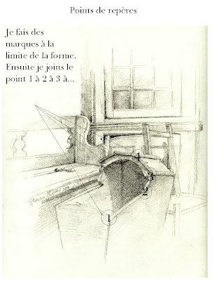 Points de repères


