jeudi 29 novembre 2007

CONCORDIA UNIVERSITY, MONTREAL

The face of Concordia University in Montreal has changed dramatically since its existence in 1974. I was a part-time student at both its founding institutions, Loyola College and Sir George Williams University in the 1970’s.

The new university started with five Faculties: a merged Faculty of Commerce, merged Faculty of Engineering, a Sir George Williams Faculty of Arts, a SGW Faculty of Science, and a Loyola Faculty of Arts and Science.

Last Saturday, looking for a place to draw indoors because it was bitter cold outside, my friends and I went into the lobby of the new Engineering, Computer Science and Visual Arts Integrated Complex of the University at Sainte-Catherine and Guy Streets. The lobby of this spacious indoor venue, which opened in September 2005, is well furnished with tables and chairs. This gave us the opportunity to draw people indoors and outdoors.

Looking out the window of the lobby I drew the first of two versions of a view looking westward along Ste-Catherine. I worked in my sketch book and used an archival ink pen, reservoir brush and pan colors. A few days later I returned and painted another study (the second illustration). This time I painted on Cartiera Magnani cold press watercolor paper in pad form (7 x 10 inches). I used both of my pocket paint brushes, the Isabey 6202 and the Kolinsky Connosisseur 405-7 flat, both brushes are available at Art Tec. I also took a few photos of the scene, one of which is posted above. All this information will be enough for me to do a larger watercolor in studio.
Regarding the black and white pencil (graphite) sketches illustrated here: These were done of passers-by walking on Sainte-Catherine Street. The strategy I used is as follows: I visually memorized a profile as the person walked by. Then I quickly sketched it before the information faded. I repeated the procedure once again but this time I added information to the original sketch from another person such as the hair or an arm holding a bag. The resulting drawing of one individual is really a composite of a few people walking in front of me. In order to succeed I had to really concentrate and jot down just the essential elements of a profile or a movement. Most people were really walking fast. Essentially this exercise enticed me to draw and invent what I wanted to see. A very good book this topic is Charles Reid’s book: Painting What you - want to – See.
I also realized while doing this exercise that as the light faded and the contrasts became less distinct it became more difficult to decipher the forms correctly. Generally it is much easier to draw a subject well illuminated from a light source. If you are interested in painting motion consult the book How to Capture Movement in your paintings by Julia Cassels.

One must never forget, however, that just reading books won’t make one a better artist. To improve one has to practice and do art. And as far as improving drawing skills – the basis of all art – nothing is better, I feel, than drawing/painting from life.
Raynald Murphy sca

samedi 24 novembre 2007

CÔTE-DES-NEIGES


Lors d’une tempête de neige à Montréal que font les mordus du dessin en plein air? C’est simple. Ils se rencontrent sur le Chemin de la Côte-des-Neiges. Ensuite, ils vont dessiner à l’abri des intempéries dans un café ou à la bibliothèque Côte-des Neiges.

Le 22 novembre, jour de la première tempête de neige, Yvon et moi avons donc dessiné bien au chaud en savourant un café dans … un café, puis à la bibliothèque située à deux pas de la bouche du Métro du même nom. Saviez-vous que sur ce toit ainsi que sur celui de la maison de la culture on retrouve le premier toit vert accessible aux citoyens d’un immeuble de la Ville de Montréal? L’inauguration a eu lieu le 5 juin de cette année.

La petite aquarelle que vous voyez ici, des lecteurs de journaux, a été dessinée sur un bloc de papier aquarelle grain fin Sennelier, 140 lb, dimensions 9’’x 4’’ environ. J’ai premièrement fait un dessin avec un stylo feutre (encre de chine). Ensuite, j’ai ajouté la couleur avec des pigments Sennelier et mon pinceau réservoir.

Lorsque je désire ajouter de la couleur à mes dessins faits dans les trains du Métro, les bibliothèques et autres endroits publics, j’utilise une petite boîte de couleurs artisanale ainsi qu’un pinceau réservoir. Ces outils sont illustrés plus bas. Une image vaut mille mots, comme on dit.


De retour à la maison, j’ai appris que le mot côte ne signifie pas nécessairement un chemin en pente, mais plutôt une « unité définitive du territoire et possiblement un synonyme de quartier ». C’est ainsi que nous avons Côte-de-Liesse, Côte-des-Neiges, Côte-Sainte-Catherine etc.


Si vous avez le goût d’aller faire du croquis sur cette «côte» n’hésitez pas. En plus de «plein de choses à dessiner ou peindre» vous aurez peut-être le goût de prendre une collation ou même un repas dans un de ses nombreux et excellents restaurants.

Raynald Murphy sca

lundi 19 novembre 2007

PAINTING IN THE MONTREAL METRO

Leonardo da Vinci advised the artist to carry a notebook ‘when you are out walking’ and jot down ‘the position and actions of men in talking, quarreling, laughing and fighting together’ with rapid notations … He advised the artist to memorize types of facial features … “(The Undressed Art – Why We Draw, by Peter Steinhart.)

I was 22 years old in 1966 the year the Montreal Metro opened. Little did I image then that I would be riding the same system forty years later with sketchbook in hand. I had not yet caught the drawing “addiction” preferring to only look at young girls while riding the rails and sometimes the art in the stations. Over one hundred works of public art by noted Quebec artists decorate many of them. Some of the most important works in the Metro include the stained-glass window at Champ-de-Mars station and the Guimard entrance at Square Victoria station. Originally consisting of 26 stations on three separate lines, the Metro now incorporates 68 stations on four lines.

The Montreal Metro was inaugurated on October 14, 1966. It was built just in time to transport citizens and tourists who had come to our city for the Expo 67 international exhibition. I still remember the peanut oil smell emanating from the braking system. My uncle Alexandre, who worked for the transit system, had told me that was the reason. The heat in the trains was unbearable. However, the system was soon modified with ceiling fans to let in some air, an engineering oversight I assume.

I began to get into the habit of carrying a sketch book and drawing people from a distance soon after a comment, similar to Leonardo’s, was made by Joanna Nash. The artist is the author of l’Art Évolutif du Dessin. (Available at Art-Tec). Other than drawing while waiting for the bus, I have found many other opportunities to sketch people such as at meetings and at musical concerts. Peter Steinhart, quoted above, claims that there is no other place on earth where people’s heads hold so still for so long as in airport waiting rooms. Train stations and Hotel Lobbies, in my experience, are also good places.

One can even paint mini watercolors, such as the ones illustrated here, while riding in one of the 759 cars of the fleet. Because the cars run entirely underground and use exclusively rubber tires instead of steel wheels the ride is relatively smooth especially if one sits near the middle of the car. I will explain how to do quick paintings while riding the Metro in a future text.


One only needs passion, persistence and the determination. Leonardo in the statement quoted above was really putting the accent on the process and the learning acquired by observing and drawing. That is what is important. What I do with these many quick scribblings is unimportant at the moment I do them. I am simply having fun and learning to see.


Raynald Murphy sca

jeudi 15 novembre 2007

LE MODÈLE VIVANT À RADIO-CANADA


Les mardis soirs entre 17h30 et 19h30 je vais à l’édifice de Radio-Canada à Montréal afin de dessiner le modèle vivant. Il y a plusieurs autres endroits à Montréal où nous pouvons pratiquer le dessin du nu.

Une trentaine d’artistes y participe. Un grand studio nous est prêté par Radio-Canada. La salle est disposée comme ceci : Au centre il y a une estrade où le modèle va poser. Deux spots sont accrochés au plafond au dessus de la plateforme. Celle-ci est encerclée d’une trentaine de pupitres. Des planches et des chevalets sont aussi disponibles pour ceux ou celles qui préfèrent travailler debout.

Vers 17h les artistes commencent à entrer la salle. Certains aident à placer les pupitres et les chaises. Nous préparons nos outils et étalons nos papiers afin d’être prêts pour la séance. François est l’organisateur de cette activité. Il fait jouer une musique ambiante. À 17h30 exacte, le modèle entre au centre du cercle et laisse tomber son vêtement. Il ou elle prend six poses de deux minutes. Des poses de cinq minutes suivront. À 18h30 il y a un repos de dix minutes. Lors de la deuxième heure le modèle présente des poses plus longues, soit de dix ou de quinze minutes.

Pourquoi dessiner le nu? Premièrement, l’histoire de l’art nous enseigne que lors de l’époque classique l’artiste qui voulait s’améliorer faisait du dessin du nu. Ça faisait parti du système d’apprentissage. Au 21e siècle chacun le fait pour divers raisons. Peter Steinhart dans son livre The Undressed Art-Why We Draw tente de répondre à cette question. D’ordre générale la plupart recherche une certaine exactitude de reproduction du modèle lors de cet exercice. Par contre l’auteur Steinhart dit : «The aim of drawing is not just to imitate nature, but to participate in it in such a way as to make new and believable worlds».

Personnellement, je dessin le modèle surtout parce que c’est un défi. On ne peut guère se tromper lorsqu’on dessine le nu. Il faut être assez exact par rapport aux proportions relatives des membres du corps. Par exemple, si le bras est trop long par rapport au torse l’observateur va le remarquer. Reproduire les formes en nature n’exige moins d’exactitude. Le dessin du corps humain habillé peut être un peu plus facile. Les vêtements simplifient et cache la forme.

Si je manque une session de dessin un mardi je le ressens. C’est devenu une drogue, une nécessité. C’est comme l’athlète qui manque une session d’entrainement. Ou encore, c’est comme le musicien qui doit pratiquer ses gammes régulièrement s’il veut s’améliorer.

J’ai peint ces deux aquarelles (6 x 12 po et 6 x 10 po) sur du papier grain fin lors des poses de dix minutes. Mon dessin préalable à l’application des couleurs a été fait au stylo feutre pointe mince à l’encre de chine.

Si ça vous intéresse de vous joindre à cette activité n’hésitez pas de me contacter.

Raynald Murphy sca

lundi 12 novembre 2007

NOTRE-DAME-DE-BON-SECOURS CHAPEL

http://www.marguerite-bourgeoys.com/en/index.aspThis historic chapel has been painted so many times by artists over the years from this view that I had promised myself never to paint it from this angle. But, as you can see, I came upon this enticing dramatic light one day and returned soon after to paint it. Truthfully, the watercolor you see was done in three stages. One cold Sunday afternoon I sat before the scene and sketched it on a sheet of Stratmore Aquarius II paper with a permanent felt pen. The near zero temperature prevented me from adding color which would not have dried anyway. So I returned another day to paint it. However, the cold once again forced me to abandon, this time because my fingers were freezing. I therefore completed the green tower and a few other sections in studio.
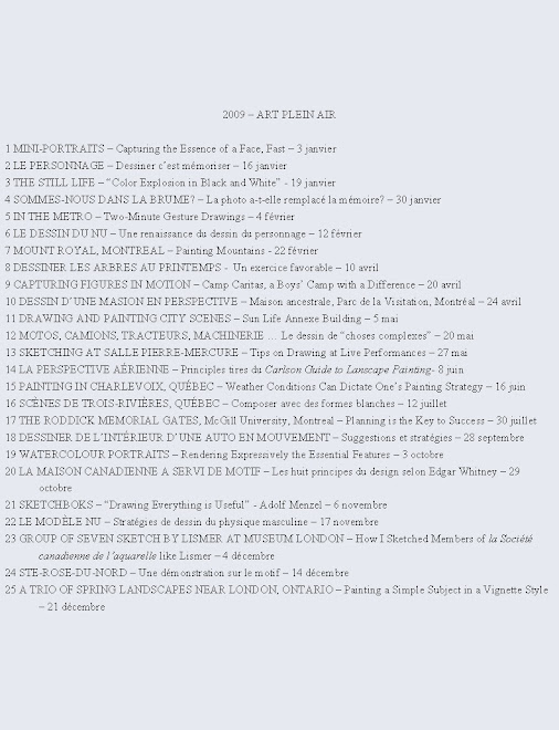
Analyze closely the color scheme of this watercolor. In general the scene was painted in tones of gray, black and ochre. The trio of red, yellow and green pigments was placed in strategic areas around the composition. These brighter chromatic colours invite the viewer to travel around the painting. The white of the unpainted paper describes the light, which, along with color is the real subject of the painting.

I like the loose feeling of the brush strokes and uneven staccato lines. The historic weathered buildings in Old Montreal lend themselves to a sketchy treatment of the architecture. However, this was probably a result of the urgency to draw and paint fast and furiously in cold weather!

Some historic notes merit mentioning:

  • This is the chapel of 1771, built over the ruins of the first stone chapel of pilgrimage whose foundations were recently uncovered.
  • Here, officers of the British regime considered setting up barracks to house the military.
    Paul Chomedey de Maisonneuve, founder of Montreal, donated the land for the original chapel.
  • Marguerite Bourgeoys was the first teacher and founder of the Congrégation de Notre-Dame. In 1655 she rallied the colonists to build a chapel of pilgrimage outside the settlement.
  • A stone chapel was finally erected in 1675.
    In 1754 fire ravaged the first chapel.
  • The British garrison included Irish and Scottish families who attended services at Notre-Dame-de-Bon-Secours. It was from this community that money was raised to begin construction of Saint Patrick’s, Montreal’s first English parish.
  • In 2005, the 350th anniversary of Notre-Dame-de-Bon-Secours was especially joyful when the “mother of the colony” returned to the chapel in Montreal’s historic district where she had lived as a beloved friend and valued counsellor to all. Her remains were placed in the left side-altar below the statue of Notre-Dame-de-Bon-Secours.

I invite you to take the time to visit the web site http://www.marguerite-bourgeos.com/ for a more detailed history of the chapel.

Finally, a visit to Old Montreal would not be complete without a visit inside this historic chapel filled with most beautiful artworks by some renowned artists. Take the time some day to do so. And bring along your sketch book! You might even feel like saying a prayer of thanksgiving, if you feel so inclined, for the early settlers of Montreal who left us such beautiful art.

Raynald Murphy sca

vendredi 9 novembre 2007

ÉGLISE SAINT-PIERRE-APÔTRE

Cette église Montréalaise de style architectural néo-gothique fut construite en 1851 par l’architecte/concepteur Victor Bourgeau. Elle a huit étages et possède un carillon français de treize cloches. L’horloge fut dessinée par Joseph Venn lui aussi un architecte de renom. Située à l’angle des rues de la Visitation et du boulevard René-Lévesque juste en face de l’édifice de Radio-Canada, elle est classée monument historique. En ce moment, des travaux sont en cours afin de préserver ce magnifique édifice qui mérite d’être visité. Vous pouvez y entrer le jour car elle est classée église ouverte.
Cette église a été peinte à deux moments différents du même endroit. La première (en haut) : Je l’ai travaillée sur papier cartiera magnani grain fin. Le sujet était éclairé par un soleil de fin d’après-midi. C’était donc les forts contrastes ainsi que le coloris qui m’ont incité à peindre cette scène.
La deuxième : Elle a été peinte sur du papier Fabriano rugueux. Elle est illustrée dans mon livre Carnet de Montréal … de A à Z en mots et en images (texte : François Barcelo) et inclut aussi l’église Sainte-Brigide au loin.

Vous avez donc ici un exemple qui illustre un même sujet peint sur des papiers de différents. Le choix du papier a joué un grand rôle dans le résultat final. L’une n’est pas nécessairement meilleure que l’autre mais seulement différente. Ajoutons à ceci un choix de pigments et d’outils différents. L’émotion de l’artiste au moment de l’exécution était sûrement autre pour plusieurs raisons. Il faisait plus froid lorsque j’ai peint la plus récente. J’ai dû la terminer en studio parce qu’elle ne séchait pas. Le vent aussi joue un rôle.

En résumé, mettons toutes ces variantes ensemble – papier, pigments, température, disposition etc. - et vous pouvez comprendre pourquoi la peinture à l’aquarelle, surtout en plein air, peut être autant un défi exaltant lors de l’exécution qu’une surprise dans le résultat. Je crois que ce sont ces conditions imprévisibles, cette marche sur la corde raide, qui me passionnent toujours lorsque je peins ou dessine sur le motif.

Raynald Murphy sca


lundi 5 novembre 2007

MACDONALD-STEWART LIBRARY BUILDING


This fall when I sketched the south façade of this Richardsonian Romanesque structure I was unaware that great and far-reaching discoveries were made inside this intriguing edifice.

This McGill University building was formerly known as the Macdonald Physics Building. It was constructed in 1893 by Sir Andrew Taylor, who designed several of the University's projects of the 1890's, and his partners at that time Morley Hogle and Huntley Davis. It was a gift of Sir William

Macdonald who was also the donor of the Old Student Union (now the McCord Museum which will be the subject of a future text). As with many of his other projects, Taylor took into account the function of the building before its ornament, though the latter was not ignored. Knowing the nature of Physics experiments and the current needs of the field, he built the entire edifice using only wood, masonry, and copper, bronze and brass for the nails and fixtures. No iron or steel was used throughout, even in the radiators, to keep magnetic interference at a minimum. The interior is of heavy brick and is constructed in large arches, many of which have since been filled in.

What attracted me to paint this building was especially the portico. This one-time entrance has two columns stating "Power" and "Knowledge", two necessities of accomplishing any work within the walls. The entrance hall fireplace has a mantelpiece declaring "Prove All Things".

Experiments conducted in the Macdonald Physics Building by a young Physics professor, Ernest Rutherford, won him the Nobel Prize for profound discoveries derived from experiments concerning the nature of radioactivity and the atom. In 1982, Taylor's building no longer met the needs of the modern Physics department. It was at this point transformed into the Macdonald-Stewart Library Building of Physical Sciences and Engineering.

The watercolour sketch was done on a 9” x 12” sheet of CARTIERA MAGNANI paper. This 140 lb hot press paper has its advantages and inconveniences. If you like to draw up your subject using a felt tip pen you will love its surface as the pen glides over it more smoothly than most cold press papers. If, however, you are working with this paper outdoors on a windy day as I did, be forewarned that you risk getting backruns. If you look closely you will notice some in my work near the top left area and likewise near the right edges. Although it is possible to “correct” these “accidents” by rewetting and lifting I do not recommend it as scrubbing on this paper seems to leave smudges. Live with it or restart the work. Nevertheless, I enjoy the way this paper leaves crisp hard clean edges such as the ones on the center pillar and the white bulbs of the lamppost.

This leads me to make some remarks or suggestions regarding designing unpainted white shapes. Jeanne Dobbie, in her book MAKING COLOR SING has a must read chapter on this topic. She says: “Areas left untouched or thinly covered reflect or ‘glow’ more than heavily painted areas, which obstruct the passage of light. As a result, the eye of the viewer goes first to these ‘glowing’ light areas.” To help you understand what she means I have outlined in the accompanying diagram the three main white shapes I left unpainted or painted palely. The coloured shapes are ruled diagonally. She says that merely leaving white paper is not the answer. The white area is a shape, form or space. It must function as part of the painting.

In the Physics Building watercolour I was very conscious, although intuitively and through experience, to design the white shapes in order to lead the eye towards the area of impact, namely: the columns, the lamppost and the student.

A note on colour design: Have you noticed that other than the white of the paper and the neutral gray I have strategically simplified my colour scheme? Three colours are placed strategically in order to lead the eye around the image. For me, careful design planning is more important than whether I create watercolor backruns.

Raynald Murphy sca

vendredi 2 novembre 2007

UNE CRISE D'IMAGINATION


Jean-Paul Ladouceur, sca, fondateur de la Société canadienne de l’aquarelle avait écrit dans la revue L’aquarelliste du numéro d’octobre 1991 ces mots qui sont affichés en permanence sur mon babillard :

«On dit que les Latins brillent surtout par leur imagination. Ceux qui le croient n’ont jamais assisté à la projection des diapositives soumises à des concours de peinture au Québec. J’ai eu ce grand bonheur de voir toutes les soumissions à tous les Salons de l’aquarelle. J’y ai vu des cabanes à sucre, des granges, Charlevoix et une armée de pauvres personnages anatomiquement infirmes à des centaines d’exemplaires. J’en ai discuté avec plusieurs des coupables. Réponse : « Il n’y a rien à peindre ici.» Voici des suggestions. Je n’ai encore rien vu ou très peu de la grosse industrie, de la machinerie, de la métallurgie, du transport, de l’histoire, de la construction, des voyages, de la navigation, des mines, du marché, du cirque, de la chasse, de la pêche, des industries du vêtement, du pétrole, de l’automobile, de la circulation, de la température, des courses, de la poste, du papier, de l’adolescence, de l’âge d’or, du monde du bébé, des ethnies, du bal, des sports, du jardinage, des religions, du folklore, des personnages importants, des foules, de la politique, des images en microscope, des très gros plans, des insectes, des reptiles, des boîtes à outils, des paniers à coudre, des armes, des jeux, des arts, des chambres à débarras, des cuisines, des ateliers, des hangars, des garages, des caves, des accessoires d’entretien, de la joie, de la peine, de la richesse, de la misère, de la guerre, etc … etc … etc …»
Ce texte continue à m’inspirer tous les jours dans la recherche de quelque chose de nouveau à peindre. La petite aquarelle affichée ci-haut à été peinte lors d’une journée pluvieuse. Je me suis assis à l’intérieur de l’édifice 1000 de la Gauchetière à Montréal et je l’ai travaillée en regardant à travers la fenêtre. L’église au loin est l’église St. Georges qui est située en face de l’entré principale de la Gare Windsor. Vers les années 1928 elle a failli d’être démolie, mais grâce à la vision et à la créativité de son recteur Rev. A.P. Gower-Rees, originaire de Yorkshire, nous pouvons encore la dessiner et y entrer prier. Les patineurs ont été croqués et colorés sur le vif à l’Atrium du même édifice le même jour. Alors, par une journée pluvieuse, un mordu du plein air, j’ai quand-même trouvé, je crois, quelques sujets intéressants à peindre ici.