vendredi 30 janvier 2009

SOMMES-NOUS DANS LA BRUME? – La photo a-t-elle remplacé la mémoire?

"Brouillard sur Lac Tremblant Nord, sapin orangé"

« Qu’est-ce qui tenait lieu de la photographie avant l’invention de l’appareil photo? On s’attend à ce que la réponse soit la gravure, le dessin, la peinture. Une réponse plus révélatrice pourrait être : la mémoire. Ce que font les photographies était auparavant fait à l’intérieure de la réflexion. » John Berger dans Uses of Photography.*


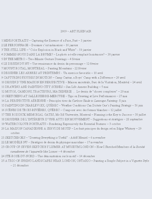
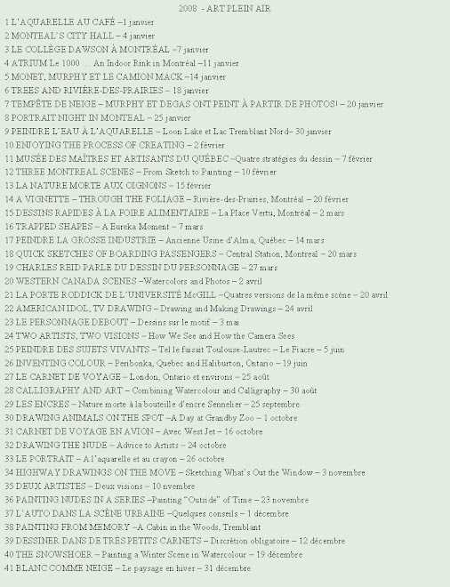
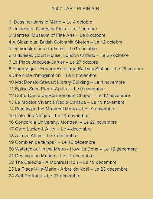
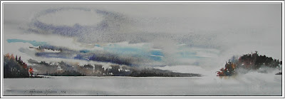
"Morning Fog and Reflection, LTN"


Le matin, j’aime m’installer au bord d’un lac afin d’observer et peindre l’effet du brouillard. Je me lève très tôt afin de me préparer avec pinceau, pigments et papier prêt à capter l’effet atmosphérique qui sera de courte durée.

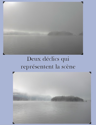
Par un matin brumeux, mon amie a documenté en photo non seulement le levé de soleil mais aussi quelques étapes de ma peinture en évolution. Comparez les photos de la scène avec celle peinte. La photo capte un très court moment. Moi, je fais une synthèse d’un phénomène atmosphérique. Voilà, je crois, la différence entre une œuvre artistique et la photo statique.

"Golden Fog Lifting, Lac Tremblant Nord"

Il faut une mémoire pour créer –tel que le suggère l’écrivain et critique d’art, John Berger. L’appareil photo ne possède pas le même type de mémoire que l’humain. La caméra n’enregistre qu’une fraction de seconde. Pendant les quelques vingt minutes que je peins le brouillard je réfléchis et j’interprète. Je développe mon aquarelle à l’aide de la même matière qui se transforme devant moi, de l’eau. C’est le médium idéal selon moi pour peindre ce sujet. Et, avec émotion et sentiments face à ce phénomène en mouvement, je place au fur et à mesure de la couleur sur le papier.


Je ne crois pas que je pourrais faire le même exercice en studio à partir de la photographie de la scène. Vaudrait mieux tenter de peindre la scène de mémoire sans aucune référence photo.


Les étapes :

1. Je mouille la partie supérieure de la feuille à partir de l’horizon jusqu’en haut. Donc, je travaille d’abord mouillé dans mouillé ciel et terre.


2. Lorsque j’ai peint une grande partie du ciel et la brume qui se diffuse sur les îles je laisse les pigments s’entremêler. Puis, je commence à peindre la section du bas, le lac. Je travaille cette partie plutôt mouillé sur sec. Il est impératif de réserver du papier non peint entre lac et terre. Autrement les couleurs des deux parties se fusionneront et je ne pourrai pas rendre l’effet blanc et lumineux entre lac et montagne.


3. Je peins des traits parfois minces parfois plus larges. Ceux-ci représentent couleur et valeur du mouvement des vagues. Entre ces lisières humides et teintées, je réserve le papier sec afin de distinguer eau colorée et reflet blanc.


4. Au fur et à mesure que le pigment s’imbibe dans le papier à l’étape du mi-humide je dépose de l’eau claire entre ces bandes de couleur afin qu’elles s’entremêlent partiellement les unes dans les autres. Finalement, il faut savoir quand s’arrêter. Si je reviens au mauvais moment dans une section fraîche et humide, l’aquarelle sera ratée.

"Brume du matin, Lac Tremblant Nord"


Je ne peins pas le brouillard, mais plutôt un événement atmosphérique ressenti.

*Selected Essays by John Berger, edited by Geoff Dyer

Raynald Murphy sca

lundi 19 janvier 2009

THE STILL LIFE – “Color Explosion in Black and White”


I wish I could paint outdoors 365 days of the year. Unfortunately this is not possible especially here in Montreal where snow and cold are with us a good part of the year. I work in my studio on these days mostly from sketches and reference photos.

Painting from three dimensional objects

However, now and then I set up a still life in my studio to get back the feeling of working from life, from three dimensional objects. I find these studies permit me to explore new techniques or different materials and also to sharpen my drawing and observation skills. The other day I had completed a painting and my materials - brushes, tubes of paint, palette and paper towels were strewn randomly on my work table. This gave me an idea. Why not paint a still life from these objects.


Advantages to working from a still life set up

There is an advantage to setting up objects on a table for a still life. First, you are in control of the composition. You manipulate the objects physically through trial and error arranging them to suit an interesting and meaningful composition. Secondly, you can orient the light source to your advantage so that if casts convenient shadows to enhance your design. Third, once you are satisfied with the set up you can re-position yourself to paint the still life from different view points.

Reviewing painting techniques and experimenting

Finally, I find that working from a still life now and then permits me to hone my painting technique at a slower pace. I treat the exercise as a sort of review of the basics of painting and an adventure into exploration. For example, I can experiment with color painting the objects different hues other than those actually in front of me. Or I might use tools I am not accustomed to, a new paint brush for example.


How I painted this still life:

1. I set up the predominantly white objects on a black ground for contrast.

2. I drew the design directly on the illustration board (Peterborough No 79) with a no 03 Micron felt tip pen starting somewhere in the middle and loosely sketching the major outlines.

3. Next, I used my COPIX permanent markers to “paint” the objects and the colored labels of the paint tubes.

4. Using Sennelier watercolor tube paints, Isabey natural hair brushes and Isabey Kolinsky rounds I rendered the colors on the palette, the shading on the tubes, the plastic paint jar and the roll of paper towel.

5. Then, using a juicy mixture of Indigo, Paynes Grey and Lamp Black I painted wet in wet in one go the background around the objects. A fine mist created the mottled effects.
Finally, once dry I added the cast shadows from the objects.

I titled my experimental Still Life: “Color Explosion in Black and White” – mixed media on illustration board, 15” x 22”.

Note: All the products mentioned in this article can be purchased at Art Tec in Montreal.

Raynald Murphy sca

vendredi 16 janvier 2009

LE PERSONNAGE – Dessiner c’est mémoriser

L’homme et la femme ont des postures qui se répètent. Nous marchons plus ou moins tous de la même façon. Si vous observez et dessinez souvent l’être humain dans toutes ses positions vous acquerrez par extention l'habileté à l’introduire dans vos œuvres, et ce possiblement de mémoire.

Les proportions du corps ne varient pas radicalement d’une personne à l’autre. En général, par exemple, nous mesurons de six à huit têtes. La taille ou le nombril est le centre du corps. Le bras placé le long du corps est à peu près au même niveau que le haut de la cuisse. La largeur du corps mesure environ trois têtes.

Plus vous dessinez le personnage sur le motif plus vous pourrez vous souvenir des mesures standard et des positions récurrentes. D’autre part, si le personnage se déplace lorsque vous le dessinez ou lorsque vous le peignez, vous pourrez probablement le compléter sans difficulté. En studio vous développerez la facilité d’imaginer le personnage dans divers positions sans références photographiques.

Voici quelques explications qui pourraient vous être utiles.


1. Ici le personnage est mis en évidence surtout parce que le blanc de la chemise contraste avec l’arrière-plan plus foncé. La bande blanche sur le pavé traverse derrière les pantalons. Elle laisse paraître un peu de blanc entre les jambes. Cette petite forme blanche triangulaire importante permet d’indiquer le mouvement du personnage.


2. Les ombres portées et les traits horizontaux pâles relient les personnages. La forme particulière de la silhouette et non le détail signale l’allure des gens.


3. Afin de créer l’illusion que le cocher est plus rapproché que la foule au loin, j’ai rendu son vêtement très net et contrasté. Par opposition la forme des gens à l’arrière-plan se dissout. Leurs contours sont flous, pâles et indistincts.


4. C’est la couleur du vêtement de chacun des personnages qui les différencie. Le trait blanc entre les personnages les sépare et il nous donne un indice d’où parvient la lumière.


5. Le patron aplat du coloris vif des vêtements, de la chevelure et des accessoires est suffisant pour décrire l’attitude des dames. Il serait inutile d’ajouter plus de détails.


6. Le mouvement des hockeyeurs est rendu par la position écartée des jambes, la position des bras, l’angle du dos courbé et l’oblique des bâtons d’hockey.


7. Nous pouvons reconnaître l’apparence particulière des personnages surtout parce qu’ils ont été peints en aplat très foncé.


8. Le zigzag rigide des traits du dessin et les taches de couleur indiquent un couple en mouvement. Nous déduisons que c’est une journée ensoleillée à cause des ombres portées sur le couple et au sol.


9. J’ai planifié le placement des formes négatives pâles entre les silhouettes foncées afin de créer variété et intérêt. Ces espaces lumineux sont aussi importants dans ma composition que les personnages peints en noir.


10. Nous reconnaissons qu’il s’agit de gens au marché même si peu de détails ont été introduits. J’ai alterné une forme foncée à côté d’une autre plus pâle. L’ovale définit la tête du personnage et on déduit d’après les silhouettes simples qu’il y a des gens à l’arrière-plan.

« Ce n’est pas le rôle de l’artiste créatif de reproduire exactement ce qu’il voit, car ceci serait de la documentation et non de l’art » Alex Powers dans Painting People in Watercolor.

Raynald Murphy sca

samedi 3 janvier 2009

MINI-PORTRAITS – Capturing the essence of a face - fast

Important portraits unlikely to be ever painted again

“It seems to me unlikely that any important portraits will ever be painted again. Photography took over this role (of recording and presenting the likeness of a person) from painting … The function of portrait painting was to underwrite and idealize a chosen social role of the sitter. It was not to present him as an ‘individual’ but, rather, as an individual monarch, bishop, landowner, merchant and so on.” – John Berger*

The portrait and photography

What is remarkable is that Berger wrote this essay in 1967 before the advent of digitized photos. What would he say about the painted portrait and photography today when recording a likeness of an ‘individual’ has fast become a daily occurrence accessible to all with camera or even a phone?

Nevertheless, the artist still seems interested in some form of portrait painting and drawing. A quick look at the 2008 index of the artist magazine records no less than eighteen entries under the category Portraits.

My feeling is that portrait painting and drawing is not dead. Today’s artist paints or draws portraits for very different reasons than did the artist before the advent of photography.


Using the camera as a tool for creative portraiture

Moreover, rather than hinder the opportunities of rendering a likeness, the camera has multiplied the ways an artist can use still photograph or movie to serve and suit his painting style.

However, painting or drawing a face the traditional way from a posed figure is inconvenient for most in our fast-paced 21st century society. Few have the time to pose for any length of time. Therefore, I have found a different way to do portraits other than drawing a volunteer or paid candidate. (Visit my entry dated January 25, 2008 – Portrait Night in Montreal)


Mini-portraits on the go

The twenty-four mini portraits illustrated here were sketched while riding the subway. ** They are a sample from a larger number of attempts. The challenge I give myself when drawing these is to capture a particular appearance. Contrary to the classic pose where the sitter knows and accepts that he or she is being drawn, the subjects here are unaware of their role. I am in fact recording a slice of life. If they move or leave I invent or start another.


How I proceed

Once I have located my subject, I study very briefly the gesture, pose or look before putting down a mark. To be discrete, it is imperative not to stare but rather to glance and memorize. My first strokes are to record the placement of the eyes, nose, mouth and chin – in that particular order. After a cursory look from these marks I render a feature or two – cheekbone, neckline or hairline – that is particular to that person. Finally, I clothe the sitter. For a profile or three-quarter pose I pay close attention to the indentation of the bridge of the nose and the correct slant and length of the nose.

Foremost in my mind while penciling the face is to concentrate on the shape of the individual features. Another priority is modeling the form from light to dark. I search for the lit surface of the face or I imagine the direction of the light.


What will I do with these quick drawings?

Even if few or any of these serve as a springboard for more elaborate work, I have attained my goal : pure enjoyment in the act of drawing for its own sake, not to mention the opportunity to practice.

* Selected Essays by John Berger: The Changing View of Man in the Portrait. (Berger is a poet, storyteller, playwright and essayist who has yielded some of the most original and compelling examinations of art and life of the past half century (20th century).
** Visit : Dessiner dans de très petits carnets -12 décembre 2008

Raynald Murphy sca