One of 78 illustrations in the book “Carnets de Montréal de A à Z,"
 text by François Barcelot, watercolors by Raynald Murphy
“Remember that it is the unexpected and unsuspected color-transitions in any object (caused by the accidental influence of environment) that are most beautiful.” - John F. Carlson.
Mount Royal rises about 233 m (764 ft) in the center of Montreal. The Laurentian Mountains are about an hour away. However, my friend Helmut,* who is of Austrian origin, claims that compared to the Alps these “mountains” are really “hills”.
Nevertheless, I find either hills or mountains fascinating to paint. Last year I had the occasion to paint the Rockies in Western Canada, some of them at 12,000 ft or more in elevation.
If possible it is best to paint or sketch a mountain after having seen and experienced it first hand. Ideally I paint mountains or hills mostly on site much like Cézanne painted Mont Saint-Victoire. One feels the immensity of mountains when painting on site and can see subtleties the camera doesn’t record. I brought back sketches and photos of Rocky Mountains from my trip to Western Canada but I must admit I have not painted from them yet.
Here are comments and technical tips on scenes of mountains or hills I have painted.
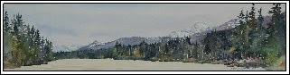
1. Notice the varied tones and subtleties of blues and purples of the Rockies. By painting the foreground darker and muted I further created an illusion of recession. (Rivière Millet, Jasper, BC, 8 x 32)
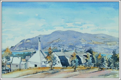 2. The hill was painted first. The sky color was added afterwards while the paper was left unpainted around the mountain to create the illusion of clouds. The color of the sky is reflected in a deeper tone in the water reflection. (Jardin des Quatre Vents, La Malbaie, Charlevoix, 15 x 22)
 3. When one’s viewpoint is close to the water surface it is imperative that the horizon line (where mountain meets lake) be absolutely level. Otherwise, it will seem that the water will flow out. (Lac de la Montagne Noir, Laurentians, 8 x 22)
 4. A sunset such as this is best painted on site in order to see and understand the effect of the setting sun on the land masses. (Loon Lake, Haliburton, Ontario, 10 x 22)
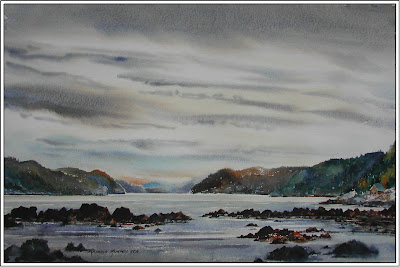 5. The sky and mountains were painted on site. Once in studio I completed the water and foreground in studio from memory. ( Anse des Roches, Saguenay, 15 x 22)
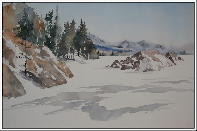 6. Painted at the same time as the sky, the mountains in the distance seem to recede. The foreground color and tones were kept warm and hard-edged to contrast the blue receding tones of the mountain. (Lac Tremblant Nord, Laurentians, 15 x 22)
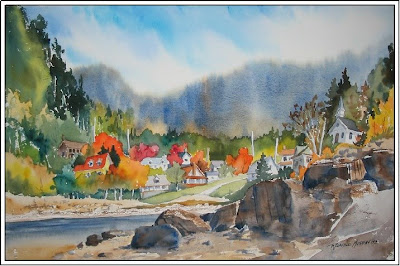 7. In a fall scene such as this it is important to avoid introducing too many warm tones into the mountains far away. Doing so would reverse. (Ste-Rose du Nord, Saguenay, 15 x 22)
 8. This painting is all about contrast of shapes and color. The soft elliptical shapes of the mountains and the misty sky contrast with the hard edged angular shapes of the foreground trees and rocks. (Le Bic, Rive Nord, 11 x 14)
Hopefully these illustrations will motivate you to paint the mountains and hills in your area and elsewhere.
Raynald Murphy sca
Note: Consult John F. Carlson’s book Carlson’s Guide to Landscape Painting for information on aerial perspective.
*My friend Helmut Ronacher intends to visit western Canada this summer and would welcome a plein air painter to join him in his trip across Canada. If interested you may contact him through the link on the sidebar.