mercredi 7 décembre 2011

PAINTING THE LYRIC THEATRE SINGERS – Noël à la Salle Tudor 2011, Ogilvy

Good sight lines make a difference
I was invited to paint at the 2011 annual Lyric Theatre Singers’ Christmas Concert. I had a clear view of the performers and musicians because I was reserved a seat. I painted two watercolors per show, one before the intermission and one after. Each took about 30-40 minutes.


Choice of Paper

I worked on Strathmore Aquarius II 80lb watercolor paper cut to 8 ½ by 22. These were folded in half lengthwise. This gave me the option of working on the elongated format or on the folded half. An A4 paper fits right onto the scanner bed. Moreover, the white paper of a scanned image will remain white when printed while a digitally photographed image renders the whites a pale blue-grey. It is possible to Photoshop the photographed digital image to eliminate the blue tint but this requires some expertise and is time consuming. Working small at concerts is more discrete and less distracting.


My Painting Setup
Usually I rest my corrugated plastic support board on my knees. I clip my paper to it. Sometimes, I attach the board on to a camera tripod. Then I slip a small round standard oil painter aluminum container (1/2 in diameter) onto a corner of the board. In the metal tray I insert a slightly smaller round plastic water container bought at the outdoor sports store La Cordée. I paint with two Kolinsky hair travel brushes. I use the smallest portable watercolor kit I own, the 8 color Windsor & Newton traveling kit found at Avenue des Arts on Victoria Ave. in Westmount. It has a convenient finger insert ring underneath and measures only 3 by 5 inches when opened. Holding this in my left hand along with a small paper towel I can support the 9 by 12 in. light plastic support with the same left hand.


My Planning Strategy at Concerts

Once the performers are on stage I spend two or three minutes observing and analyzing before putting a mark on my sheet. During this precious time I plan mentally the composition; where the main characters will be placed; the limits of the drawing and especially what I intend to include and to omit. I first draw the bones of the main performer and furniture. I will draw more precisely the contour of the foreground figures but I will only indicate the secondary ones with a summary line. The drawing takes about five minutes.


The Painting Phase

All the skin tones are put in first since these tend to be the lightest tones. While these heads, necks and arms are still partly humid I tint these further to indicate hair and shadow. I attempt to leave the figures further back diffused and less defined. I work much the same way with the clothing by adding lighter more diffused color to those in the background. The shapes, figures, instruments and furniture in the foreground are painted darker and hard edged. Background color is added next in a loose diffused manner stopping just short of the contour of the figures. I attempt to harmonize the background color with the remainder of the scene. When painting a complex scene often less is more. By this I mean that I try to limit my range of colors to a few complementary colors and a couple of cool colors.

A Note about the Lyric Singers

The Montreal based choral group has a long history. Other than performing its annual Christmas Concert at Ogilvy, the director Bob Bachelor leads the signers in stage performances in the spring and at other benefit concerts. In the spring of 2012 the troupe will put on the full Broadway show Curtains between May 31 and June 9. For more information visit their web site. Experience a wonderful evening of choral music by attending their next performance if you have not done so yet! And if you missed the Sing Noël Christmas Concert at Tudor Hall, you can attend the same show at the Rialto Théatre, 5723 ave. du Parc, Sunday December 11th at 2:00 pm.
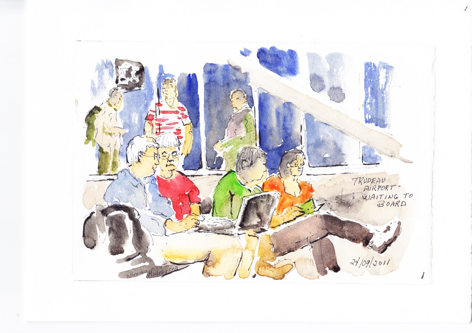
Raynald Murphy sca

Note: Be sure to read Marilynn Vanderstaay's review about the Lyric Theratre Singers on
The Westmount Examiner's next publication.

vendredi 2 décembre 2011

CARNETS D’AVION – Le dessin en voyage avec AIR FRANCE

Certains trouvent le voyage en avion long et ennuyant.  Personnellement voyager me plaît particulièrement parce que j’en profite pour dessiner des sujets inhabituels. Afin d’augmenter le plaisir en voyage il s’agit d’apporter en cabine du matériel de petit format pour dessiner et même peindre.


À l’aéroport
Lorsque vous êtes dans la salle d’embarcation pourquoi ne pas dessiner discrètement les passagers assis. Parce qu’ils sont plutôt immobiles vous aurez même le temps d’ajouter de l’aquarelle à votre croquis. J’ai peint ces passagers dans la salle d’attente à l’aéroport Pierre Trudeau à Montréal sur du papier Stratmore Aquarius II format 20cm x 28 cm.

Aquarelle à partir de la fenêtre
La chance était de mon côté parce que j’étais assis près du hublot. J’ai saisi l’occasion pour dessiner quelques avions sur le tarmac de l’aéroport Charles de Gaulle. Le contraste du blanc de l’avion contre un ciel bleuté et les couleurs bleu, blanc et rouge des appareils m’ont inspiré.

Peindre un passager endormi
J’ai peint discrètement le portrait du passager assis tout près. Son profil contrastait clairement devant un arrière-plan plutôt gris. Au matin je lui ai montré le dessin de lui et ai promis de le lui envoyer par courriel. Il était ravi.


Une perspective inhabituelle en regardant par la fenêtre
Rares sont les moments où nous avons une vue d’un paysage d’une telle hauteur. L’avion nous offre cette « gâterie». Quelques couleurs pigées de mon petit ‘kit’ Windsor et Newton et la suggestion du rebord du hublot nous situe au-dessus d’une rive de la mer Méditerranéen.


Les engins un et deux
J’ai été ému en peignant les moteurs gigantesques de l’appareil qui nous transportait. J’ai observé le mécanisme complexe de ces engins se transformer lors du décollage tout en les dessinant avec un crayon feutre noir pointe 03 de marque Prismacolor ainsi qu’un pinceau réservoir encre de Chine GFKP de marque Pentel. J’ai ensuite ajouté la couleur avec un pinceau réservoir.


Une scène inhabituelle
En attente sur le tarmac j’ai pu dessiner au crayon feutre pointe 03 de marque Prismacolor l’avion en face dans lequel on chargeait les bagages. C’était une occasion privilégiée à ne pas manquer. J’ai rendu les valeurs par des hachures.


Études au crayon graphite
J’ai saisi ici le moment opportun pour faire le portrait d’un passager endormi, des profils et des mains entrelacées dans un cahier format A4 marque Daler Rowney Cachet.


Le dessin d’un lecteur
Avant d’aborder ce dessin d’une personne assise très près je l’ai observée pendant quelques minutes afin de juger si elle allait demeurer immobile assez longtemps pour faire une étude prolongée. Comme elle lisait elle n’a pas bougé, donc j’ai pu facilement faire son dessin au crayon graphite 2B. J’ai aussi ajouté l’étude d’une main d’un passager sur la même page.


Dessiner dans un cahier au papier coloré
Ce genre de cahier de marque Daler Rowney Cachet tinté beige/ocre me permet d’ajouter au crayon Prismacolor du blanc avec le crayon de cire de la même marque pour rendre les formes plus pâles. Le format 22cm par 14cm de ce cahier se transporte facilement dans l’avion sans être trop encombrant.


Dessiner le service du lunch
Le défi ici est de dessiner un personnage en mouvement. Je dessine sommairement les contours du corps avant qu’il ne bouge et je reviens plus tard ajouter les valeurs.


Le dessin de mes outils
J’ai dessiné à l’aquarelle les outils qui mon servi pendant mes trois semaines en Europe. J’ai placé ceux-ci sur la petite tablette devant moi afin de les observer. L’étui de douze pastilles d’aquarelles de marque Windsor et Newton ne mesure que 6 cm par 8 cm. Un anneau lié en dessus sert à le retenir par un doigt. Un petit contenant d’eau en plastique de 4 cm de diamètre était suffisant pour le travail sur des feuilles 20 cm par 28 cm. J’ai aussi travaillé avec quelques pinceaux de type voyage où la section poil se referme dans le manche comme un stylo.


 Ne partez pas en voyage sans vos crayons et carnets
La prochaine fois que vous voyagerez en avion pourquoi ne pas apporter avec vous dans la cabine quelques outils de dessin ou même un petit ensemble de pastilles d’aquarelle. Faites ces dessins, très simples ou plus complexes, selon votre niveau d’expertise pour le simple plaisir d’observer et de vous amuser. Vous verrez au retour chez vous que ces souvenirs croqués resteront marqués dans votre mémoire non seulement parce que vous aurez observé intensément mais parce que vous aurez fait des marques sur le papier. Ce seront des souvenirs plus précieux, j’ose dire, que des centaines de photos de voyage.
Raynald Murphy sca


jeudi 17 novembre 2011

Old Montreal as seen by two artists – Carnets du Vieux Montréal; an illustrated tour of Old Montreal


How the book Carnets du Vieux-Montréal evolved
Over the past four years, my friend Yvon and I often sketched together outdoors in Old Montreal. After a drawing session he would post his sketches and historical notes on his blog. My Old Montreal watercolors would also at times appear on my blog site. Over a few years we both had accumulated a large file of drawings and watercolors. He had researched the history of the region extensively. One day while chatting over coffee we decided to suggest to the editor of Les Heures Bleues to publish our vision of Old Montreal.


Our table top book, the Carnets
A carnet is a French term with the dictionary equivalent of ‘notebook’ which in English carries the connotation of notes one writes in a blank or ruled book. However, in the book-publishing milieu the French term Carnets de … can include more than just written notes; it can also contain drawings, sketches, paintings and/or photos along with hand-written text. The closest English equivalent terminology I can think of is ‘A Picture and Word Journal’. Therefore, the Carnets … or Journal … as a tabletop book can present varied themes such as: Carnets du Cirque or Carnets d’automobile. The Carnets can illustrate a town, a region or a city such as: Carnets de Paris or Carnets de Montréal for example.

How the book is organized
The editor of Les Heures Bleues approved our project and determined the deadline. We organized the book as simulated walking tours which we called Randonnées. There are four of these: Place Vauquelin, Palais de Justice, Place d’Armes and Hors Circuit (sites outside Old Montreal boundaries). Between 144 pages there are 77 numerically identified historical stops with notes. Watercolors, drawings and text are pleasantly interwoven in a table top soft cover format.


A word about the watercolors and drawings
Almost all the watercolors in the book were painted on site. Sometimes I added color later. However, as the May 1st 2011 deadline approached, we noticed that I had not yet painted certain important scenes. I could not wait for warmer weather to do so comfortably, so I often donned gloves, tuque and warm boots and sketched outdoors between January and April. My water colors would have frozen had I added color outside so I sometimes found the closest coffee shop after having sketched to warm up and add the color. Although working on site is sometimes uncomfortable, both Yvon and I feel that there is no better way to capture the feeling and sense of a scene rather than using photo references exclusively.


The text and organization of the material
I cannot praise enough my friend Yvon’s organizational skills not to mention the countless hours he spent researching the history of Old Montreal while I amused myself drawing or painting in the Old Town – a much more pleasant task than his. He wrote all the text, combined these with the images and finalized the all the last minute details while I was vacationing in Europe in October. We hope you will enjoy touring Old Montreal through our artist’s eyes. We will be signing our book at the Salon du Livre in Place Bonaventure November 19th and 20th between 1pm and 3pm. The Montreal book show is on between the 16th and 21st.

 
Hoping to see you at the Salon,
Raynald Murphy and Yvon Masse

Note: To purchase a copy of the book click here or contact one of the authors.


samedi 12 novembre 2011

Carnets du Vieux Montréal – Deux passionnés du plein air vous offrent leur vision


Après un travail de quatre ans, mon ami Yvon Masse et moi sommes heureux de vous offrir le Carnets du Vieux-Montréal, Éditions Les Heures Bleues. Le lancement officiel du livre aura lieu au Salon du Livre de Montréal du 16 au 21 novembre à la Place Bonaventure de Montréal. Nous nous ferons un plaisir de dédicacer ce livre rempli d’aquarelles et de dessins de 147 pages au kiosque DIMEDIA les 19 et 20 novembre entre 13h et 15h.


En 2007 j’avais illustré Carnets de Montréal de A à Z … en mots et en images de la même maison d’édition, en collaboration avec François Barcelo, écrivain. Suite à sa parution en avril de la même année, j’ai continué à croquer et à peindre surtout le secteur du Vieux Montréal. Mon ami Yvon m’accompagnait assez souvent et on dessinait ensemble un aspect du patrimoine.  Un jour, au café, est venue l’idée du Carnets du Vieux Montréal avec un aspect historique et de nombreuses illustrations. Yvon, que l’histoire a toujours intéressé avait déjà commencé pour son plaisir personnel à chercher l’historique des lieux et édifices anciens du Vieux-Montréal. Mes aquarelles et dessins s’ajouteraient donc à son écrit et à ses croquis parfois colorés à l’aquarelle.


Avant de présenter notre projet à la maison d’édition Les Heures Bleues nous avons décidé d’un plan. Le Carnets serait diviser en quatre randonnés : Place Vauquelin, Palais de Justice,  place d’Armes et certains édifices Hors Circuit. C’est alors que Les Heures Bleues acceptèrent notre dessein. En élaborant et en ajoutant au fur et à mesure des lieux pertinents, nous sommes arrivés à 77 sites qui illustrent et décrivent en sommaire le patrimoine du Vieux Montréal.


Yvon et moi avons ensuite numériser nos dessins et aquarelles. En se servant du programme Excel de Word, Yvon a commencé à placer dans un ordre déterminé les textes et les images. Après une deuxième rencontre chez l’éditeur pour une mise à jour de notre projet, nous avons pu déterminer ce qui nous manquait. Parce que nous étions en hiver et que la date de tombée fixée en mai approchait, j’ai dû, à défaut de temps, peindre certains lieux au cœur de l’hiver ou presque avec mains gantés et tuque sur la tête … dehors. J’ai par nécessité découvert presque tous les restos-café du Vieux Montréal où je me refugiai au chaud pour ajouter les touches de couleur à mes dessins coqués sur le motif!


Vers la fin de l’été nous avons reçu les premières épreuves par Internet. Les ajustements ont commencé. J’étais en voyage en Europe en octobre lorsque les derniers ajouts et décisions ont été pris par mon compétant ami, Yvon. J’ai eu en main le livre le 7 novembre. Depuis ce jour je n’ai eu que des accolades des gens qui ont feuilleté le Carnets du Vieux-Montréal. Nous espérons que vous aurez autant de plaisir à admirer les œuvres et à découvrir l’historique de Montréal que nous avons eu à le créer!

Au plaisir de se rencontrer au Salon du Livre à Montréal.

Raynald Murphy et Yvon Masse


mardi 6 septembre 2011

SKETCHING PEOPLE AT AN EVENT – Drawing at Camp Kinkora’s 85th anniversary celebration

Keep your sketching equipment simple when drawing people

I knew that there would be hundreds of people at the anniversary celebration I was to attend. I also realized that I would be moving from one location to another drawing as quickly as possible whomever and whatever I could. I sat or stood wherever I could with sketchbook in hand. This was not the time to use a complicated array of materials. Simple meant: graphite pencils (HB, 2B, 4B, 6B), a 03 point felt marker (Prismacolor) and an 8 ½” x 11” DALER ROWNEY SOHO open flat (80 sheet) light sketchbook.


1. Start somewhere in the middle, draw the head first

When I draw people in a crowd I usually select a person who is standing or sitting still. I immediately do an accurate contour drawing of his or her head. This shape determines the relative scale of the rest of the scene including the size of the other figures. The heads shapes in the foreground will be larger and those recessed will be proportionately smaller and less detailed.


2. Compose and design, don’t just draw isolated people

At an event people are interacting. It is the ideal time to “catch” and draw people in action, facing each other, looking away, holding hands for example or in an embrace. If you see a musician or singer, draw him or her. Usually they stand pretty still.


3. Integrate or suggest the location

In the lower portion of page 3, I integrated an arched doorway in the design leading towards the figure. This darker doorway shape contrasts against the white robe of the figure in front of it and the white table cloth. There are repeated echoes of the arched shape in the figure and the dish on the table.


4. Quickly learn to identify potentially still subjects

In the bottom left section of page 4, I was able to render rather easily two people because I assumed that they would be in a state of repose for a while due to the placement of their arms. Usually someone who crosses one’s arms or rests one’s head on one’s arms will remain in that position for at least a few minutes.


5. If possible create “lead into” forms

In sketch no 5 I am leading the viewer into the scene through the stem of the guitar at right, also via the arm of the foreground figure at left and by the oblique fold of the corner of the table cloth near his hand. The arch of the doorway also leads us to the main figure. Finally, his hand leads us back to the center of the scene.


6. Identify geometric shapes and arrange them to create your design

In the drawing on page 6 I contrasted the “ovals”, spheres and arcs and the foreground shapes against the strait edged shapes of the houses and cabins in the background. The foreground spheres of the heads, for example, stand out sharply against the triangular and rectangular shapes behind them.


7. Use dark contrast whenever possible

Daumier was a master at the skilful use of light against dark in his drawings. I have used here a similar technique by rendering the middle row of people with an India ink brush pen. My intention was to indicate the time of day, early evening or dusk.


8. Ink and graphite work well together depending on …

I first sketched the main outline of the scene of page 8 using a fine tip felt pen (03). Then I rendered the intermediate values using HB through 6B graphite pencils. Finally, using the brush ink pen I added black highlights at strategic points. It is tempting in a complex scene such as this to say too much. Sometimes more is said by what is left out.

The next time you are invited to a celebration, bring along your sketch book and pencils to record the event discretely. I promise you will enjoy and remember it much more.

Raynald Murphy sca

About Camp Kinkora


At the anniversary celebration Fr. John Walsh, who is know for his talk show on CJAD, had some very meaningful words to share with us. I will quote parts of his talk.

“…thousands and thousands of children benefit from Camp. Kids who never could appreciate life learned about the joys of life, kids who found it hard to get along with others learned the strength of team work, kids whose parents were not reliable role models found role models in councilors and directors at Kinkora, and many who had no meaning in life found meaning and stayed close to the camp and became CITs (Councilors In Training) and then Councilors…

… An exasperated mother, whose son was always getting into mischief, finally asked him, “How do you expect to get into Heaven?”The boy thought it over and said, “Well, I’ll just run in and out and in and out and keep slamming the door until St. Peter says ‘For Heaven’s sake, Jimmy, come in or stay out!’”

… Camp is a time of education being led out of ignorance and this will be a great challenge for all of us in the years to come. Back into the future … we need to listen to others more than ever. No wonder we have two ears and one mouth… listen twice as much as we speak. And listen everywhere. Lady Gaga says:

"It doesn't matter if you love him, or capital H-I-M
Just put your paws up
Because you were born this way, baby

My mama told me when I was young
We are all born superstars

She rolled my hair and put my lipstick on
In the glass of her boudoir

"There's nothing wrong with loving who you are"
She said, "Because he made you perfect, babe"

"So hold you head up girl and you'll go far
Listen to me when I say"

I'm beautiful in my way
Because God makes no mistakes
I'm on the right track baby
I was born this way

Don't hide yourself in regret
Just love yourself and you're set
I'm on the right track, baby
I was born this way

Give yourself prudence
And love your friends
Subway kid, rejoice your truth
In the religion of the insecure

I must be myself, respect my youth
Just be a queen
Whether you're broke or evergreen
You're black, white, beige, chola descent

You're Lebanese, you're Orient
Whether life's disabilities

Left you outcast, bullied, or teased
Rejoice and love yourself today
Because baby, you were born this way

No matter gay, straight, or bi,
Lesbian, transgendered life
I'm on the right track, baby
I was born to survive

No matter black, white or beige
Chola or Orient made
I'm on the right track, baby
I was born to be brave

I'm beautiful in my way
Because God makes no mistakes
I'm on the right track, baby
I was born this way"

This is what camp accomplished more than anything else, it gave you your individuality and enabled you to grow into the Person God intended you to be…”

Thank you, John, for these timely reminders.

mercredi 3 août 2011

LE DESSIN AU CRAYON GRAPHITE – Un atelier de dessin en plein air en Abitibi, Québec

Atelier à Palmarolle du 4 au 8 juillet

Au début de juillet à l’École Beaux-Arts Rosa-Bonheur à Palmarolle, Québec, j’ai dirigé un atelier de Dessin et Aquarelle en Carnets d’Artistes. Nous avons dessiné cette pittoresque région pendant cinq jours en utilisant divers outils, médiums et stratégies. Une courte discussion suivait chaque exercice et j’ajoutais quelques commentaires pertinents sur la page de mon carnet. Je vous présente ces exercices faites au graphite en espérant qu’ils vous motiveront à poursuivre votre propre démarche.


It is not necessary to “say” or draw everything. Leave some parts undefined in order to involve the observer.


The “Capitan” of the riverboat posed for us. Notice the direction of the light – left to right indicated by the values especially on the face and the uniform.


Create a path or entrance to lead us into the drawing, a road, for example.


A drawing can be reduced to four values - white, black and two intermediate values. This simplifies the “reading” of the sketch.


Notice here the variety of the pencil line. Some, for example, are faint while other lines are more intense. A line can also be deliberate or fanciful, for example. By changing its direction one can suggest the “flow” of the foliage, for example.


When drawing clothing in a close-up figure it is a good idea to indicate fold lines in the cloth. These will suggest stress or force.


Depending on the direction of the light “lose” the line here and there where the sun meets the figure. Accentuate the line darkly in shadow areas away from the light.


A figure either standing or seated should “feel” stable. Through close observation and good drawing make us “feel” stability in your figure drawings.


When drawing a profile view of a face in shadow, shade it evenly right up to the edge in order to clearly define the contour of the face. Otherwise, it will be difficult to “read” the facial contour shape.


Some drawings, especially subjects found in close up nature, are better started in the middle. Let your drawing evolve outwards and fame it with a pencil line after completion.


Always think shape and value when drawing. It is also permitted to let your drawing “overflow” its borders.


Réflexions d’un participant

« Ce que j’ai retenu de plus important, au cours de la semaine qu’on a passé ensemble, à croquer le motif, c’est que : Jamais une photographie n’apportera la compréhension du réel qui nous entoure, avec la même intensité que la réalité le fera elle-même. Je pense que c’est probablement parce que l’émotion que peu déclencher une photographie n’est qu’un vague souvenir de l’émotion réelle vécue. »

Pierre Legendre

Le dessin en plein air

Il me fera plaisir de diriger un atelier semblable dans votre région. Vous pouvez communiquer avec moi via mon adresse courriel : raynaldmurphy@yahoo.com.

Raynald Murphy scahttp://www.bonjourquebec.com/qc-fr/abitibi.html

vendredi 22 juillet 2011

FOOD COURT SKETCHES – Where to draw on a rainy day


A rainy day drawing venue

A few weeks ago I was feeling down because a sequence of rainy days was preventing me from my usual plein air sketching and painting. Because my weekly life drawing and portrait sessions were postponed until the fall I was looking for a venue where I could draw and keep up my practice. Then, it occurred to me that after a few minutes drive to the local mall I would find plenty of drawing material there.

My equipment

I decided to draw in a Daler Rowney CACHET 5 in x 7 in toned paper sketch book. I brought with me some Derwent Drawing pencils –Ivory black no 6700, Venetian Red no 63 and the Derwent Colorsoft Pimento C540.


Food court at a mall an ideal spot

I found a seat not far from a group of seniors chatting at a food court. These were great subjects to draw. When one moved, I started to draw another and so on.

Drawing card players is another option

Moving to another part of the food court I found another group, this time younger, of subjects to draw – card players. Because card players are intent in their game they are also good subjects to sketch.


Drawing a couple of friends or lovers talking

My final drawing venue was at a section where two friends were intently talking to each other. Here the advantage is that they will usually maintain the same head position making it easier to capture likeness and detail.


Bad weather is no excuse not to draw

Other subjects that can be drawn in bad weather are things around the house. You might even ask your partner to pose for you. Then, look out the window and draw what is there. Hop in your car and draw what is out the window. Take the subway if you live in a large city and draw there. These are but a few of the possibilities and I am sure you can find many more. The hardest part is to pick up pencil or pen and paper and get out of the house. The rest is pure joy. The sunshine will be within.

Raynald Murphy sca