jeudi 24 avril 2008

AMERICAN IDOL – TV DRAWING – Drawing and making drawings

“There is a vast difference between drawing and making drawings. The things that you will do – over and over again – are but practice. They should represent to you only the result of an effort to study, the by-product of your mental and physical activity. Your progress is charted, not on paper, but in the increased knowledge with which you look at life around you.” Nicolaides in The Natural Way to Draw.

On Tuesdays I attempt to develop my drawing skills by challenging myself. I make drawings in a moving subway car on my way to a life drawing session. (Visit my earlier blogs). Before arriving I might stop at a café and make more drawings of people. Again, drawing a shifting model can be frustrating but only if one worries about the resulting sketch. Another challenge is drawing the live model. Finally, arriving back home and trying to capture on paper the essence of a fleeting “camera shot” of a singer on the TV show American Idol can seem to be a formidable task.
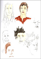

Nicolades says there is a vast difference between drawing – doing a nice neat finished drawing for its own sake, or maybe even to exhibit - and making drawings. I agree. When I am making drawings I am studying what is around me and making exploratory marks on paper. I am also developing a skill and a system of graphic symbols. But most importantly I am doing so for myself, to learn. I am not afraid to make mistakes. As a matter of fact, trial and error is part of learning. Actually, if I am not making mistakes, I feel I am not progressing. I am just repeating myself, therefore not really learning.
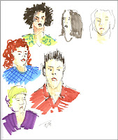

Michael Merzenich, a leading neuroplastician, says : “…practicing a new skill, under the right conditions, can change hundreds of millions and possibly billions of the connections between the nerve cells in our brain maps… we can also change the very structure of the brain itself and increase its capacity to learn. Unlike a computer, the brain is constantly adapting itself.” (Quoted from The Brain That Changes Itself, by Norman Doidge, M.D.)
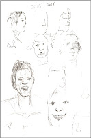

Just think of the possible billions of connections I am making in my brain while making drawings and enjoying the process while doing so!

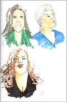
So, the next time you are watching American Idol or a similar TV show, reach for your sketch book. Seize the opportunity to increase your knowledge of the human form. You will also be increasing your brain power! One can more easily draw from newscasts, talk shows, stand-up comedy and shows such as American or Canadian Idol. There are often close-up of people on these shows. Hosts and guests stand relatively still.
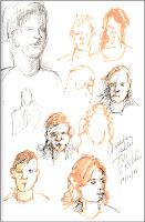
Technical note: The illustrated drawings were done in an 8 ½” x 11” sketch book using a variety of tools: graphite pencils, Nero soft pencils, Permanent Micron ink pens and permanent color COPIC markers.

Raynald Murphy sca

dimanche 20 avril 2008

LA PORTE RODDICK DE L’UNIVERSITÉ MCGILL - Quatre versions de la même scène

Version (1) : 9 x 12, papier Aquarius

En 1924, l’Université McGill acquit une entrée permanente et monumentale. Lady Redapth Roddick a fait un don des portes en mémoire de son mari, Sir Thomas George Roddick, un médecin de renom qui initia la pratique régulière de la chirurgie stérile utilisant des antiseptiques. Parce ce que Sir Thomas était un homme ponctuel Lady Roddick décida à propos que le monument commémoratif incorporerait une tourelle à horloges.
Version (2) 6 x 6 , papier Aquabee
Située au pied de l’avenue McGill College cette porte historique est toujours intéressante à peindre ou à dessiner. Peu importe le médium utilisé, certains principes d’ordre générale s’appliquent. Les voici.

Direction de la lumière : Aussi simple qu’on peut le penser, il n’y a qu’un soleil qui brille sur la terre. Donc, lorsque je m’assois devant mon sujet je recherche immédiatement d’où vient l’éclairage. Afin que je m’en souvienne, je l’indique par une petite flèche en haut de la feuille. À partir de ce moment toutes les surfaces d’édifices doivent être éclairées du même côté. Les ombres portées doivent aussi se diriger dans le même angle.

Version (3) : 9 x 12, Papier Pentalic Nature Sketch

Composition et conception (design) : Depuis un certain temps, je ne fais plus d’étude préalable avant d’aborder une œuvre en plein air. L’exercice est quand-même valable. J’opte plutôt, tel que fait aussi Charles Reid (voir mon dernier article), de commencer en quelque part sur la feuille et de laisser le dessin ou la peinture évoluer. Une marque amène l’autre et ainsi de suite. Par contre, je suis très conscient des lignes de direction dans ma composition. J’aime faire entrer le spectateur tantôt par un trottoir (1) et (4), un banc de neige (2) ou même par un véhicule qui lui-même entre dans la scène (3). La contrepartie de cette stratégie est de placer des « stops » ou barrières afin de ramener le regard du spectateur à l’intérieur du tableau ou du dessin. Dans trois des exemples ici les lampadaires et poteaux de signalisation nous empêchent de sortir visuellement du tableau. Les angles obliques du sommet du monument (1), du toit de l’édifice de droite à l’arrière-plan, (2) et de la courbe de l’arbre de droite (3) nous incitent à revenir revisiter la scène.

Version (4) : 12 x 9, Papier Fabriano

Harmonie : Nous pouvons parler de l’harmonie des traits, des valeurs et de la couleur. Des volumes entiers ont été écrits à ces propos. En résumé, en ce qui concerne les traits, je crois qu’on doit ressentir un geste qui semble se répéter dans l’ensemble de l’œuvre. L’éclairage de la scène détermine l’intensité des valeurs. Par exemple, par une journée très ensoleillée (1) et (2), les valeurs seront plus distinctes et contrastées que par une journée plus ombragée (3). Quant à la couleur, demandez-vous s’il y a récurrence d’un coloris ici et là. Ceci n’empêche pas de placer un accent d’une couleur vive à un endroit important par rapport à la composition afin de centrer le regard du spectateur (2) et (3). Utiliser une palette limitée est une autre façon de créer l’harmonie de couleurs.

L’exercice de peindre le même sujet à différent moment de l’année ou à partir d’un angle différent incite l’artiste à voir et peindre ce qu’il veut et non seulement ce qui est devant lui.

NOTES D’ORDRE TECHNIQUE: Version (1) : peint sur papier Aquarius II 80 lbs avec pigments Hobein et autres marques. Version (2) : peint dans un carnet spirale Aquabee super deluxe, 93 lbs. pigments Fragonard et pinceau réservoir. Version (3) : peint dans un cahier de marque Pentalic Nature Sketch, avec marqueurs Copic, stylo Micron, pigments Fragonard et pinceaux Isabey Petit Gris. Version (4) : peinte sur papier Fabriano 50% cotton avec pigments Fragonard.

Raynald Murphy sca

mercredi 2 avril 2008

WESTERN CANADA SCENES – Watercolours and Photos


Charles Reid, in the Spring 2008 issue of WATERCOLOR Magazine, says: “I find that some watercolorists can get so technically good that the work looks dead.”

My feeling is that a “too technically good” watercolor is often the result of an over dependence on the use of the photograph. I feel that working from life or from nature as often as possible brings life to one’s work. There is nothing wrong with using photos as an aid, but plein air work and experience is very important.


In order to support these statements I examined photos which were taken at the same time as I painted a couple of scenes on site last summer in the Rockies. Could I have succeeded as well working only from the photos? I don’t think so. Here are my reasons:


Emotional reaction: One advantage of sketching on site is that it gives me ample time to feel and record my emotional reaction to the scene. A photograph will record details but not recall feelings.

Painting what I want to see: Painting on site permits me to choose immediately what I wish to say. The 360 degree panorama of the outdoors allows me to compose the scene according to my wishes. I can select or eliminate. When working solely from a photograph the temptation is to reproduce without interpretation the composed or cropped scene. The resulting painting often “looks like a photograph”.


Three-dimensional sensation: Photographs flatten the scene and distort perspective. Color and value are rarely reproduced correctly especially in shadow areas. When one paints on site one sees the actual color and values in nature. Also, the camera has but one lens, we have two. This permits us to see shapes as three-dimensional.


Climatic changes: During the time that one sketches a scene the quality of light can change. For example, the sky may become cloudy or change color. The photo is limiting since it records but one moment in time. When painting solely from a photo, one has either to copy the light recorded or invent it. The plein air sketch is a composite of atmospheric changes observed, integrated and recorded.

Simplify: When asked what Charles Reid considered the most important pieces of advice he could offer the artists he teaches, he answered: “Simplify, know what you want to say …” It is difficult to simplify a photographed scene. Photos generally say too much or too little. It is easier to edit a scene when on site. Working within an abbreviated time frame invites simplification and synthesis.


Finally, while teaching at a workshop recently, I was surprised that my book of travel sketches and drawings took so long to be returned to me as it was circulated around the hall. Had I circulated photos of the same scenes they surely would have been returned much quicker. I rarely look at my travel photos. However, I never tire looking at the sketches of the same scenes.

Raynald Murphy sca