lundi 21 décembre 2009

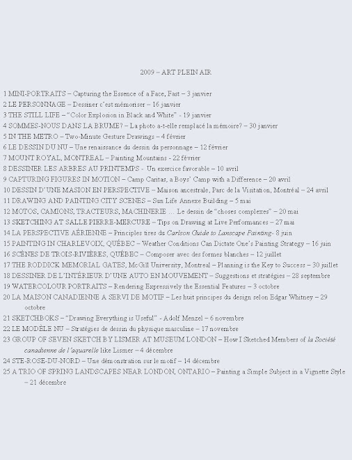
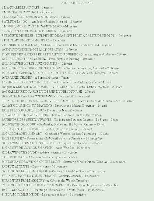
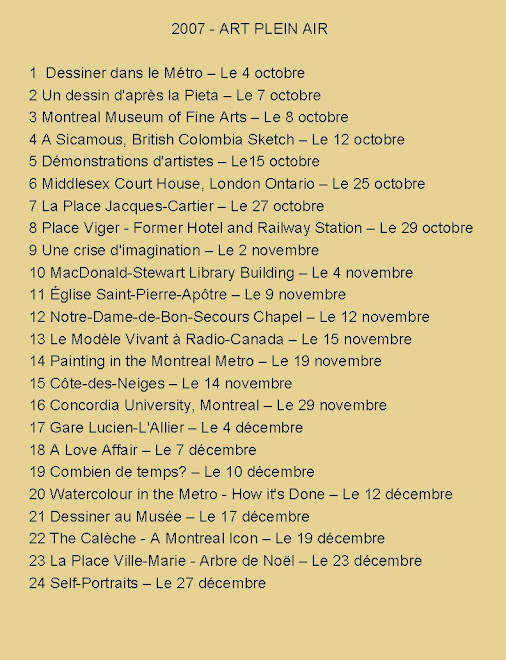
A TRIO OF SPRING LANDSCAPES NEAR LONDON, ONTARIO – Painting a simple subject in a vignette style


“In no process that I know of – least of all in sketching – can time be really gained by precipitation.” From The Elements of Drawing by John Ruskin

Finding a motif in farm country

Recently as I drove north of the town of London, Ontario I came upon wonderful vintage farm structures on Five, Six or Seven … Mile Road. I found tightly-knit clusters of trees, bushes, fields and buildings silhouetted against a plain skyline just waiting to be sketched and painted.

Varied shapes, denuded trees in late November

The varied shapes of houses, deciduous and evergreen trees contrasting against a plain background were begging to be painted. I find it easier to represent the intricate forms of trunks and branches at this time of the year especially because deciduous trees are leafless.


Nature’s muted colors are at their best in late fall

Summer is not my favorite painting season mainly because I do not like the stark redundant greens of the season. I prefer landscape painting either in the spring or fall right up to the first snow fall. Then I retreat to the comfort of a warm studio. Although the air can be quite cool in November and not practical for outdoor work I usually work from my car when possible.

Choice of paper is relative to the situation

“Once you have mastered basic watercolor techniques using one kind of paper,” I tell my students, “experiment with different papers. Choose one that suits the subject matter before you.” For these subjects I chose Strathmore Aquarius II paper – a very white paper - for two reasons. First, the skies were quite white resembling the pure white of Aquarius II paper. Secondly, I wanted to draw the subject in ink. Its smooth surface is ideal for ink work.


Drawing directly with a waterproof Indian ink pen

I outlined the forms directly in ink with no preliminary pencil drawing knowing that the drawing could not be altered or erased. Following John Ruskin’s advice, I did not precipitate or rush the drawing phase but observed intensely and measured mentally before putting down any line on the paper. When painting from the motif at this time of year in northern latitudes the sun is low on the horizon for long periods of time. Therefore, the quality and intensity of light will change little over a long period, an advantage to on site work.

Invention and choice of “vignette” style for these

In reality, there were no roads, paths or fields leading into the picture in these three scenes. I invented them to let the viewer enter visually. The vignette style, where one does not paint right up to the borders, allows one to focus more on the center of interest - here the area around the buildings. Finally, I wanted these watercolors to have the feel of a drawing. Therefore, I left a good portion of the paper untouched like in a sketch.

Simple subjects sometimes produce best results

Sometimes, it is while painting simple small formats subjects that I find greater pleasure. I was quite satisfied while I painted these and also with the result. Why not try painting a similar subject in your area? You might also enjoy it.

Raynald Murphy sca


lundi 14 décembre 2009

STE-ROSE-DU-NORD – Une démonstration sur le motif


Le village pittoresque Ste-Rose-du-Nord et le Saguenay est une région très souvent visitée par les peintres figuratifs. Voici les étapes parcourues lors d’une aquarelle peinte en direct. Elle représente le village tel on le voit à l’arrivé. J’espère que cette démonstration saura vous motiver autant à visiter cette région du Québec qu’à peindre sur le motif aussi souvent que possible.


1. J’esquisse d’abord les formes principales sur du papier d’Arches rugueux, format 15 po. par 22 po. Je dessine avec un crayon graphite HB ou 2B afin de bien voir les marques par une journée ensoleillée. Au préalable, la feuille avait été trempée dans l’eau et brochée sur une planche afin qu’elle reste plus tendue lors du travail.


2. Je peins d’abord le ciel mouillé sur mouillé. Sans attendre que le papier sèche, je peins la montagne de l’autre côté du fleuve avec des teintes froides tout en fusionnant le sommet dans le ciel encore humide pour une transition douce entre ciel et montagne. Avant de peindre le fleuve d’un mélange de bleus, je réserve une mince lisière de papier non peinte entre la montagne et le fleuve afin de traduire l’éclat de lumière. Pour représenter la direction de la lumière je peins d’un gris-bleu les ombres portées des bâtiments blancs ainsi que les toits.


3. Des teintes d’orange et de jaune sont déposées intenses mais diffuses sur le flanc des deux montagnes au plan moyen. Je laisse sécher ces lavis. Un avant-plan aux couleurs chaudes suggérant du foin en mouvement est peint mouillé sur mouillé. Cette bande floue et pâle contrastera avec les champs de couleurs plus foncées qui seront peintes plus tard.


4. Les deux collines sont peintes mouillé sur mouillé. Le blanc du papier ici et là ainsi que le flou du mouillé pâle représentent lumière et atmosphère. Les orangés et les jaunes de la couche précédente paraissent maintenant à travers les verts et les bleus déposés par-dessus. Les couleurs les plus intenses, les contours tranchés ainsi que les formes les plus variées sont peintes autour du centre d’intérêt qui se situe dans la vallée près du fleuve.


5. Les lisières des champs sont peintes l’une après l’autre mouillé sur sec sans qu’une section ne fusionne dans l’autre. Je tente de représenter la mosaïque du paysage par cette technique. Les poteaux pâles des clôtures sont contournés et seront peints plus tard.


6. Les poteaux de clôtures et d’électricité non peints contrastent contre les formes horizontales des champs. Ceux-ci seront peints en studio en dégradé du pâle au brun foncé.


7. Seulement quelques touches sont ajoutées à cette phase. Je réalise que l’éclairage a bien changé depuis le moment où j’ai commencé à peindre. Il est donc inutile de continuer sur place et il est préférable de terminer en studio. J’ai en mémoire le paysage et mes intentions.


Je doute que j’aurais pu interpréter la scène aussi bien à partir uniquement de la photo. Il aurait été très difficile de représenter aussi facilement le coloris, les détails et surtout le sentiment ressenti. Même si on se sent parfois inconfortable, le travail sur le motif permet souvent un résultat supérieur à celui en studio et ce à divers niveaux.

Raynald Murphy sca

vendredi 4 décembre 2009

GROUP OF SEVEN SKETCH BY LISMER AT MUSEUM LONDON – How I sketched members of la Société canadienne de l’aquarelle like Lismer


Museum London


Museum London (Ontario) has received an important Group of Seven artwork for its permanent collection. The London Free Press mentions that the untitled sketch on paper in charcoal and pencil was done by Lismer in 1930. Reporter Rumleski says: “Think about artists going out into the natural world and doing sketches. Typically, we don’t put as much recognition on the sketch as we do on the larger piece.” The present show hopes to turn this around by showing that this sketch and others are actually major pieces.


Drawing at a meeting of the SCA


Like Lismer in 1930, artists Helmut Ronacher, Luigi Tiengo and I, members of la Société canadienne de l’aquarelle, likewise drew sketches of our friends at our annual meeting on November 14th. I have posted some of mine here. Maybe many years from now when we are no longer here our “meeting sketches” will also be considered “major pieces” as is Lismer’s sketch today!


Draw while you listen


Most meetings are listening affairs so I have realized that I can practice portrait drawing while I listen. At meetings most people face forward, are attentive and stay relatively still. This gives me the opportunity to draw various facial views depending where I am sitting.


Seating around a table


If members are seated around a table, then it is more difficult to draw participants discretely. In such cases I will revert to drawing small portraits in the margins of distributed papers. Also, I will try to sit as far away from the board members as possible. This gives me a better view of most members.


Seating auditorium style


The type of arrangement where board members are seated at a table facing the assembly is ideal. Arriving early I will try to sit at the back of the room. This permits me to look diagonally across the assembly and the chance to draw profile or near profiles.


Choice of sketch book


I prefer to draw these “meeting portraits” in a bound sketch book rather than in a spiral book. Drawing in a spiral book tends to draw attention because the format signals sketching. Size matters here. A smaller book is preferable because it is less visible and it can be manipulated easier. I recommend a format not larger than 5 in. by 7 in.

Choice of drawing tools

Nero or Derwent pencils are my preferred pencils. I also sketch with graphite pencils, a thin felt marker, soluble ink pens or other tools but the advantage of these pencils is that they render values from very light to black. These composite pencils are available as very soft, soft, medium and hard. They are also available in sepia and sanguine tones. However, you will have to experiment and see what suits you.


Pencil sharpening

I have drifted away from sharpening my pencils with a mechanical sharpener for two reasons. Firstly, sharpeners tend to “eat away the lead” especially the softer leads. Sharpening pencils with an x-acto type blade produces a sharper and more elongated point. I can thereby shade more easily with the side of the pencil. To further sharpen the pencil end I rub the tip on sandpaper.

The next time you are at a meeting why not sketch. It might become wonderfully addictive as it has for me not to mention that your drawings might also have “value” one day!

Raynald Murphy sca