jeudi 12 janvier 2012

ACHIEVING LIGHT IN WATERCOLORS – Quotes from Jeanne Dobie’s & Charles Reid’s books


About these five watercolors
Look at these five watercolors carefully. Have you noticed how many white shapes were left unpainted?  I believe that is what makes them look bright and joyful. Both Making Color Sing by Jeanne Dobie and Charles Reid’s Watercolor Secrets are must read books equally for the beginner and for the advanced watercolorist. Dobie talks about the importance of whites while Reid explains how painting in watercolor in ordinary sketchbooks helped improve many facets of his art.


The importance of whites in watercolors according to Jeanne Dobie

“Your whites should be like pearls, containing many beautiful colors and yet remaining white.”
“Keying your whites can make the difference between a watercolor with an ordinary light-dark contrast and a watercolor that develops a glowing contrast.”
“When I ask students, ‘What is the strongest element in a painting?’ the usual responses are: spontaneity, technical control, a strong dark design. While these are desirable qualities, my students seldom think of the simplest element of all – leaving the white paper white.”
“If the viewer’s eye is drawn first to the light areas of a painting, shouldn’t the artist develop the white shapes into something distinctive?
“…For the untouched white paper to be the strongest elements in a painting, I stress the idea of working with unpainted shapes from the beginning.”


Charles Reid in Watercolor Secrets has this to say

Sketchbooks taught me about the importance of time (actually the lack of it) needed to make a good drawing or painting while working on the spot. I learned that I didn’t have time for sketching with searching lines; I needed a single, carefully considered contour line to capture my subject or scene. Slowly my drawing improved. I started painting in sketchbooks in the late 1970’s, suing the same light drawing paper, and found that I couldn’t correct or use overwashes on fragile sketchbook paper.
This changed my approach to all of my watercolor painting. Even when I paint with heavier watercolor paper, I strive for the correct tonal-value with my first try. I don’t always manage a finish with my fist try but it’s always my goal.

Strive for the correct tonal value from the start

I painted this series of watercolors on Strathmore Aquarius II 80 lb. paper. This paper is soft and does not accept corrections well, if at all. Paradoxically that is one reason why I like the paper. I strive for the correct value from the start like Charles Reid and never think of “correcting”. For me, a painting either works or it doesn’t. It is only a sheet of paper and modifying the original washes makes the watercolor loose its freshness. I prefer starting over. Also, like Charles Reid, I sometimes paint in ordinary fragile paper sketchbooks. As a matter of fact, some of the watercolors painted by Yvon Masse and myself which were reproduced in our latest book “Carnets du Vieux-Montréal” were painted on ordinary paper, not on watercolor paper.

NOTE: Two of the five posted paintings were done on site at Camp Kinkora located near Montreal. The other three were worked in the studio using elements from these and from sketches done outdoors. I did not use any photo references for this series since I had plenty of information and I am also very familiar with the site.
Raynald Murphy sca

mardi 3 janvier 2012

JE DESSINE LE PERSONNAGE SUR LE MOTIF – J’en fais à la tonne, et je crois m’améliorer petit à petit

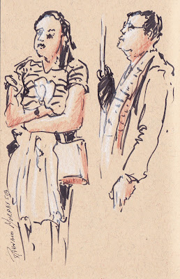
Lorsque je quitte la maison j’apporte toujours un carnet et quelques crayons et stylos afin d’être prêt à dessiner en toutes occasions.

J’aime croquer tous genres de sujets, mais c’est le dessin du personnage qui m’attire beaucoup parce qu’il présente un certain défi.


Dessiner le personnage avec une certaine précision sans exagérer aucune partie du corps semble parfois difficile pour le débutant. L’exactitude des proportions est possible lorsqu’on en fait en quantité et avec passion.


On peut tricher lorsqu’on dessine un arbre ou même un bâtiment mais c’est plus difficile avec l’être humain.


La raison en est que la plupart des gens ont une bonne connaissance des proportions des membres du corps humain et perçoivent immédiatement la moindre erreur.


 Donc, on ne peut guère s’éloigner des standards sans que notre personnage ne semble disproportionné.


Je dessine souvent le personnage lorsque je voyage en métro ou en attente sur la plateforme.


Je dessine ces temps-ci dans un carnet à couverture rigide de la marque Cachet par Daler Rowney, format 20 cm x 13 cm. Le papier teinté crème me permet d’ajouter du blanc avec un crayon de cire de la marque Prismacolor afin de rendre la valeur plus pâle.


Pour rendre les valeurs plus foncées j’utilise une variété de crayons : le crayon graphite, les crayons de cire ou même des stylos-feutres à pointe mince ou larges. Comme bien des choses, on s’habitue aux inconvénients du mouvement du wagon lorsqu’on dessine souvent. Lors de l’arrêt du train en station, les quelques secondes où la rame est immobile permettent  de dessiner les formes principales des victimes.


Les formes initiales, surtout les contours, sont souvent faits avec un marqueur feutre noir. Ceci m’incite à me concentrer d’avantage car le stylo permanent ne pardonne pas. Il y a une centaine de pages dans mon carnet, donc je n’ai pas à m’inquiéter si je fais une erreur. J’en commence un nouveau à côté du premier. De toute façon, je dessine pour mon plaisir sans penser à la publication. Comme pour la musique, ces croquis sont mes gammes et non le concert.

Si le temps me le permet, j’ajoute tout de suite les valeurs à mes premiers contours. Mais si trop de gens m’entourent,  je reviens sur mes dessins plus tard. Le refuge d’un resto-café est aussi un endroit que je privilégie pour les compléter.

Par contre, je préfère ne pas toujours remplir,  colorier ou ajouter au dessin initial.  Souvent j’aime mieux laisser la ligne définir la forme par elle-même. Certains traits par leur caractère initial soit minces ou épais décrivent déjà le personnage.


C’est l’action et le processus du dessin qui me passionnent. Je tente de saisir une tranche d’un moment vécu et de le transcrire sur papier à ma façon.


Bref, on s’améliore et on arrive à une calligraphie personnelle en dessinant souvent sur le motif. Il n’y a pas de raccourci.


En ce début d’année 2012, pourquoi ne pas se donner le mandat et le plaisir de dessiner le personnage pour soi-même, et de le faire le plus souvent que possible?


Je vous promets des résultats surprenants si vous persistez.
Raynald Murphy sca