
“Montreal’s city hall, the ornate château on Notre-Dame St., is a Phoenix-like building; it arose out of the ashes of 1878. It not only replaces the old city hall; it embodies its dashing style. The building of 1878 was designed by Henri Maurice Perreault. Inspired, it is said, by the Hôtel de Ville in Paris. Today’s city hall has the panache of 19th-century France. The fire that ravaged Henri-Perreault’s building was one of the most terrific Montreal has ever seen. The whole city hall that night seemed to have become one tremendous copper-colored flame.” Edgar Andrew Collard in Montreal Yesterdays, published by The Gazette.
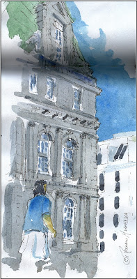
Whenever I paint Montreal’s city hall I find it both fascinating a challenge. Its intricate Parisian style architecture makes it an interesting subject to draw and paint from various view points.
My approach when tackling such complex architecture as our city hall is not to attempt to get it all in. Rather, I try to render one part of the building more complete and defined, suggesting the rest. The limits of the painting are left fluid and fuzzy. Sometimes I will leave the white of the paper around parts of the contours untouched in a vignette style.
Another technique I sometimes use is to choose a viewpoint where the intricate contours of one corner of the building is clearly defined. Architectural details at the edges such as cornices and ledges can be rendered quite precisely while similar forms and shapes elsewhere are suggested.
Here are other strategies that I have found useful when painting buildings:
Avoid painting the structure face on with the building running horizontally across the paper or canvas. If you do try to place an object such as a car or a person to lead the eye in. Another option, as in the sketch below, is to leave one end of the building unfinished or out of focus.

Assure yourself that one façade is in light while the adjacent side is in shade. That way the defining shapes of intricate architecture will appear more legible.
Introduce the light and the color of the sky in reflection in windows even though in actuality the windows may appear black. Leave bits of white or pale gray here and there in windows and doorways.
Repeat intricate patterns of architecture with slight variations elsewhere in your painting to create unity.
The more complex the architecture the simpler the color scheme should be I feel. A monochrome treatment sometimes works best. Otherwise, a too complex palette leads to confusion. The viewer is distracted by it making it difficult to understand the intricate architecture.
It is a good strategy generally to lead the eye into the picture via a street for example. Other ways are to place a shape, such as a foreground figure, a wall or a vehicle in the foreground.
Finally, there is no better way to improve your painting of architecture than actually working on site rather than from a photo. Among other inconveniences, the photo distorts perspective and reflected light in shade is not picked up or seen by the camera as well as by the human eye.
Suggested book: I have found Mike Chaplin’s treatment of buildings in his book Painting Expressive Watercolors published by HarperCollins quite interesting and inspiring.
 Raynald Murphy sca


Aucun commentaire:
Enregistrer un commentaire