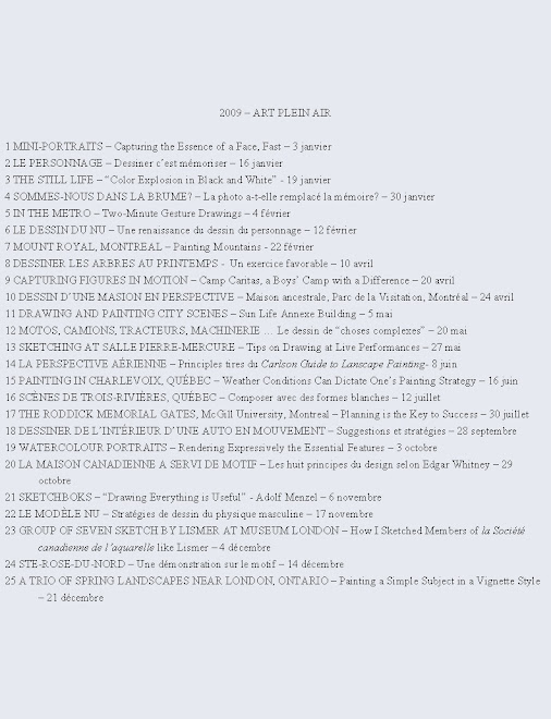
 Rembrandt created eighty-odd self-portraits. Looking through my file of drawings and paintings I was only able to come up with about six self-portraits. Of these, a charcoal drawing done around 1975 for a University drawing course has obvious proportion flaws, but there is a slight resemblance. The 1990 color pastel was drawn from a photo during a pastel workshop. It has some redeeming qualities but it is definitely not one of my best works.
The first of three
 portraits labeled 2007 was done a few days ago looking in a mirror. I painted on No. 79 Peterboro illustration board. It was the first time I tried this type of board. Essentially it is an acid-free Cold Press watercolour paper mounted on board. Sold in a 30” x 40” format, the board can easily be cut with an exacto knife.
 I drew the main shapes with a 2B graphite pencil and painted the initial washes with a No. 12 Isabey petit gris brush, the largest in the family. Wetting the right-hand side of the face in shadow with clear water, I dipped this generous brush into a mixture of Raw Sienna and Burnt Sienna. The paint flowed easily over the board and I immediately noticed that the paint was not being absorbed quickly. This gave me ample time to go back into the wash and adjust the values.
Adding a little Ultramarine Deep into the mixture I then painted the blocked out shapes on the left-hand side of the face. Next, I grayed the mixture a bit more and painted in the hair. The lighted side of the face at this point was still paper white and contrasted well with the dark shapes. I should have stopped immediately but instead wet the untouched white area and the gray bled into it. I was able to quickly remove some of the colour but the beautiful stark contrast was lost except for some highlights on the nose, lips and chin.
That is the risk one takes when trying out a new paper or board, but I feel that jumping in and painting a subject is more stimulating and profitable than painting little color swatches on unfamiliar paper. Anyway, I still have eight boards left, cut to approximately 10” x 13” to try out. What is important is that I had fun and learned while trying out a new brand of paper and a new brush. Then, I promised myself to do one self-portrait a day for 30 days using various mediums.

So, I painted a second time on Peterboro board. The resulting painting outlined in ink produced a brighter more colorful rendition but a less successful resemblance than the first attempt. The third in the proposed series of 30 was done with 2B and 4B graphite pencil on paper.
Although at first it might seem boring to draw oneself often, it has so far been very interesting. I am learning something every time and honing my skills. Foremost is the fact that your model is always available. Vary the medium used, the lighting and the approach. It is not necessary, for example to draw or paint the whole face.

If you are interested in the subject of portraits, here are the titles of a couple of recommended books and one magazine article : Rembrandt’s Nose by Michael Taylor is a well-written insightful book about how the artist painted portraits. Visages des voyageurs is mainly a flip through picture book of Martine Le Coz’s creative renditions of writers of the XXth century. Yvon Masse’s article Portrait, portrait, in L’aquarelliste, Août 2006 explains how to organize a portrait night. In Harley Brown’s Eternal truths for every artist, the most important words in the book are: “I, ________________, do hereby declare that, from this day forward, I will do a drawing, from life, for a half hour every day, for the rest of my life. So help me Harley.”
That being said, I must go draw my fourth self-portrait of the proposed series.
Raynald Murphy sca


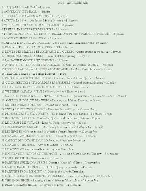
 Although the subject matter illustrated here might seem daunting and complicated to draw for some, you can easily opt for a simpler motif. The key to the success of this card idea is the use of a permanent felt pen for the line drawing. Whether or not you go over the lines with the colors will make little difference in the outcome. Actually, the looseness of paint application will make the finished card more animated and personal I feel. Sign it and your recipient will be thrilled.


 Last Saturday, looking for a place to draw indoors because it was bitter cold outside, my friends and I went into the lobby of the new Engineering, Computer Science and Visual Arts Integrated Complex of the University at Sainte-Catherine and Guy Streets. The lobby of this spacious indoor venue, which opened in September 2005, is well furnished with tables and chairs. This gave us the opportunity to draw people indoors and outdoors.
 Looking out the window of the lobby I drew the first of two versions of a view looking westward along Ste-Catherine. I worked in my sketch book and used an archival ink pen, reservoir brush and pan colors. A few days later I returned and painted another study (the second illustration). This time I painted on Cartiera Magnani cold press watercolor paper in pad form (7 x 10 inches). I used both of my pocket paint brushes, the Isabey 6202 and the Kolinsky Connosisseur 405-7 flat, both brushes are available at
  Regarding the black and white pencil (graphite) sketches illustrated here: These were done of passers-by walking on Sainte-Catherine Street. The strategy I used is as follows: I visually memorized a profile as the person walked by. Then I quickly sketched it before the information faded. I repeated the procedure once again but this time I added information to the original sketch from another person such as the hair or an arm holding a bag. The resulting drawing of one individual is really a composite of a few people walking in front of me. In order to succeed I had to really concentrate and jot down just the essential elements of a profile or a movement. Most people were really walking fast. Essentially this exercise enticed me to draw and invent what I wanted to see. A very good book this topic is Charles Reid’s book:
  I also realized while doing this exercise that as the light faded and the contrasts became less distinct it became more difficult to decipher the forms correctly. Generally it is much easier to draw a subject well illuminated from a light source. If you are interested in painting motion consult the book
  One must never forget, however, that just reading books won’t make one a better artist. To improve one has to practice and do art. And as far as improving drawing skills – the basis of all art – nothing is better, I feel, than drawing/painting from life.
 Raynald Murphy sca
 Raynald Murphy sca


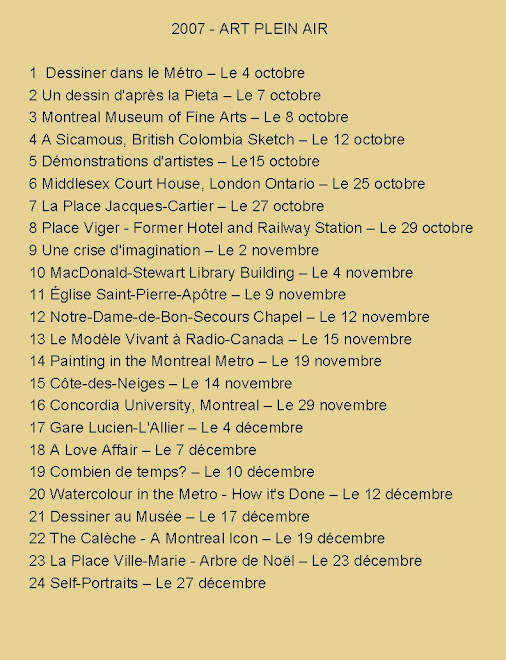
 Pourquoi dessiner le nu? Premièrement, l’histoire de l’art nous enseigne que lors de l’époque classique l’artiste qui voulait s’améliorer faisait du dessin du nu. Ça faisait parti du système d’apprentissage. Au 21e siècle chacun le fait pour divers raisons. Peter Steinhart dans son livre
  This historic chapel has been painted so many times by artists over the years from this view that I had promised myself never to paint it from this angle. But, as you can see, I came upon this enticing dramatic light one day and returned soon after to paint it. Truthfully, the watercolor you see was done in three stages. One cold Sunday afternoon I sat before the scene and sketched it on a sheet of Stratmore Aquarius II paper with a permanent felt pen. The near zero temperature prevented me from adding color which would not have dried anyway. So I returned another day to paint it. However, the cold once again forced me to abandon, this time because my fingers were freezing. I therefore completed the green tower and a few other sections in studio.


